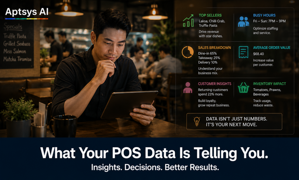
Your POS system generates a report every single day. Most Singapore restaurant operators glance at total sales, maybe check if the number looks right, and close the tab.
That is a missed opportunity — and in a margin-thin business, missed opportunities add up.
The data sitting in your POS is not just a record of what happened. It is a set of signals telling you what to fix, what to double down on, and where your team or your menu is quietly costing you money. The problem is knowing which numbers to look at and what they mean.
Here are five things your POS data is likely telling you right now.
1. Which Items Are Slowing Down Your Tables
Every menu has items that take longer to prepare than they earn. If a dish needs fifteen minutes in the kitchen and sells for $12, it is doing two things: occupying a cook’s attention and keeping your table from turning.
Pull your item sales report and sort by quantity sold, then cross-reference with your kitchen timing data if you have it. Look for low-volume items that your kitchen flags as complex or slow. These are the items worth reviewing — either reprice them, simplify the prep, or cut them from the menu.
A leaner menu that moves fast is almost always more profitable than a long menu with dead weight at the bottom.
2. Your Actual Peak Hours vs What You Think They Are
Ask most restaurant owners when they are busiest and they will say lunch and dinner. But POS data often tells a more specific story: the real rush is 12:15pm to 1:00pm, not 12:00pm to 2:00pm. Or Thursday dinner is consistently your highest revenue night, not Friday.
Run a sales-by-hour report across a few weeks. Then look at your roster. If your staffing schedule is built on assumptions rather than data, you are probably overstaffed in the wrong hours and understaffed when it counts.
Matching your team to actual demand — not perceived demand — is one of the fastest ways to reduce labour cost without reducing service quality.
3. Voids and Discounts — and What They Signal
Every void and every discount in your POS has a story behind it. Some are legitimate: a customer changed their mind, a dish was wrong, a manager approved a goodwill gesture. But patterns in your void and discount report can also signal something else: errors, shortcuts, or misuse.
If one staff member accounts for a disproportionate share of voids, that is worth a conversation. If discounts are spiking on weekend evenings when your supervisors are occupied, that is worth a closer look at your approval flow.
Run this report monthly. You are not looking to catch anyone — you are looking for patterns that point to a process problem, a training gap, or something that needs tightening.
4. Category Mix and the Drinks Problem
Here is one that many Singapore restaurant operators overlook: the ratio of food to beverage sales.
Drinks are typically high-margin items with fast turnover. If your category mix shows that beverage sales are declining as a share of total revenue, it usually means one of two things — your team is not offering, or your menu is not prompting.
A well-timed “can I get you a drink?” or a QR menu that surfaces beverages prominently at the right moment can meaningfully shift this ratio. But you would not know to address it unless you were looking at the category split.
Check your mix quarterly. A shift of even five percentage points in beverage attach rate can have a noticeable impact on your margins.
5. Spend Per Head Over Time
Your average transaction value tells you one thing. Spend per head — total revenue divided by number of covers — tells you something more useful: whether each customer is spending more or less than they used to.
If spend per head is declining, the causes are usually one of three things: your upselling has dropped off, your menu mix has shifted toward lower-value items, or you are filling tables with smaller groups. Each of these has a different fix.
Track this month on month. When it drops, it is a prompt to investigate. When it rises, it tells you something you are doing is working — and worth doing more of.
Why History Matters More Than Yesterday
There is a limit to what a single day’s report can tell you. One slow Tuesday could be the weather. One strong Saturday could be a nearby event. A single data point is noise — a trend is a signal.
This is where a data warehouse changes what is possible. Rather than looking at yesterday in isolation, you are looking at the last three months of Tuesdays. You can see whether your Monday lunch has been declining for six weeks or just had a bad run. You can compare this August to last August and know whether a drop in covers is seasonal or structural.
The difference between a restaurant that reacts and a restaurant that plans is usually the difference between daily reporting and historical range. Day-by-day data tells you what happened. Trend data tells you what is happening — and gives you enough of a picture to do something about it before it becomes a problem.
Aptsys stores your transaction history in a data warehouse so that the insights above are not limited to the past thirty days. When you ask “is this normal?”, there is enough data behind the answer to actually know.
The Data Is There. The Question Is Whether You Look at It.
None of these reports require a separate analytics tool. They are built into any decent POS system. The gap is not data — it is attention.
Jade POS surfaces these metrics without requiring you to build custom reports or export spreadsheets. Sales by hour, item performance, void tracking, category mix, spend per head — backed by historical data that gives your numbers context and range.
If you want to see what your data is telling you, talk to us at aptsys.com.sg/aptsys-solutions/jade-pos-aptsys/.